Eye tracking data is notoriously hard to represent visually. It’s dense, high dimensional, and can’t be compressed without losing important information. The industry standard graphic, a heatmap of the combined tracks of all participants in a study, does a good job representing the amount of attention each area of the page got. However, it has crippling disadvantages.
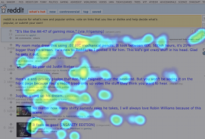
A heatmap only represents the distribution of interest on a page; it reveals nothing about the order in which participants looked at areas of the page. It represents all participants with a single graphic and gives no sense of the variability of the ways in which participants approached a page. Worst of all, it invites the reader to infer that all study participants had tracks more or less similar to that of the overall heatmap. This is completely wrong; in fact, it’s entirely possible that no single participant had a track remotely similar to that of the combined heatmap.
An eyetracking infographic that makes up for these disadvantages would make an excellent partner for a heatmap. Such an infographic would have three goals: it should tell a story – represent the order in which participants looked at areas on the screen – and this story should be as broadly representative as possible. One way or another, people examining eyetracking data are going to commit the fallacy of composition: they will assume that each individual participant’s track is similar to that of the study as a whole. This new infographic should strive to ensure that this assumption is correct, even though it is not logically valid.
The infographic we invented with these goals in mind is shown below, next to a heatmap generated from the same data. We’re calling it a transition graph, after the physics/CS concept.
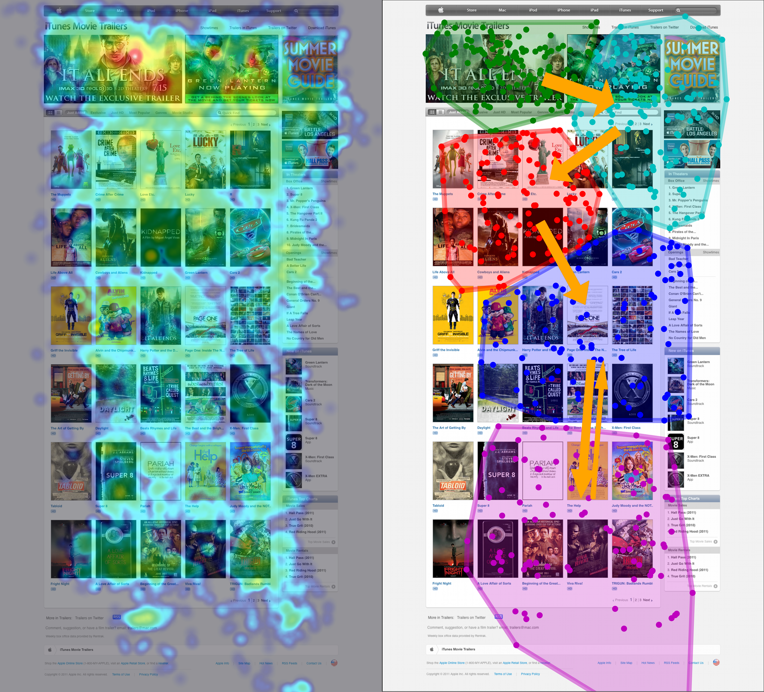
To build these graphics, we first cluster the points together. Then, for each cluster, we draw an arrow to the cluster that study participants most frequently looked at after looking at the first cluster. Arrow width is proportional to this frequency.
Sometimes, these arrows form a clear path through the different parts of the image — the Apple Trailers page above is an example of this. In this case, the path is the most representative way to think about how users traverse the page. It isn’t necessarily true that all users looked at the page this way; however, this is the best single representation of the way they looked. Even if the arrows don’t form a clear path, the reader still gets a sense of how the areas of the site relate to each other over time. Eye tracking users who rely only on heatmaps neglect this aspect of the data at their own peril.
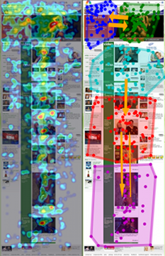
Below are transition graphs for three more GazeHawk studies, along with the accompanying heatmaps. We’d really like to hear from the community, particularly data visualization specialists, on what you think about this visualization.
How would you like to see this? How would you represent this?


I’m surprised you’re using polygons to divide the areas. Why not use hints from the underlying page’s DOM to group the gaze locations and transitions? I realize that humans don’t necessarly look at the same rectangles as defined in the DOM, but it would make the data more actionable for a designer to take feedback on.
That’s actually something we’re looking heavily into (and have some really exciting technology built around). However, for things like full-page advertisements, and even video, there are no DOM cues, so we need to support clustering like in these examples. The next step is to support manually specified areas of interest, which would allow us to tie this into DOM data if we so choose.
As an MVP, Id suggest not worrying too much about the DOM and letting your customers quickly draw polygons to define the page into Elements. That would be the easiest and fool proof way to get started right away.
Oops. I guess thats what you said you would do as next steps.
Hey guys – we’ve used / recommended your service many times over to Conversion Voodoo clients and I love to see you on the track of a leap-forward in this arena.
I think what’s missing in the formatting above is the “time” dimension.
As in I’d love to see an animation that reflects the attention of multi-user studies across time.
Throw out the noise, give an “average” of how and when users arrive at each page element and then you’re solving not only for the “where” but also the “when”.
That’s a crucial piece of data in trying to solve for user abandons, etc.
Hi Zack,
Great to hear from you! We’re looking into building a video based off of this where the arrows grow over time. This will allow us to aggregate visual patterns over time, adding in the temporal element that is so painfully missing from heatmaps and many other static visualizations.
If google analtytics could offer something like this, then it will really be helpful.
What’s the time resolution of your tracker? Can you follow someone reading?
We can absolutely follow someone reading. We sample gaze coordinates 30 times per second, which is way above the rate at which the human eye moves when reading.
A few comments:
* What clustering algorithm are you using and how you are picking the number of clusters? Since your visualisation is based on the clusters, getting this right will be critical for success. Looking at the cluster shapes I’d guess either k-means or hierarchical with ward’s distance. But how are you picking the number of clusters?
* I think you need to be very careful when you draw cluster convex hulls – this has the tendency to make clusters look much more distinct than they really are (probably because of the gestalt principle of connectedness). Take a sample from a bivariate normal, cluster it and then display the clusters with convex hulls – they look really distinct but you know they’re not. I’d want to explore rectangular bounding boxes since they have a natural correspondence to the generally rectangular underlying page elements.
* I’d be interested to see alternatives without the clustering – e.g. what if you use a rectangular grid? If you made the grid cells smaller and smaller (maybe with some smoothing) you could end up with something like a vector field showing average movement around the page.
* I think you’re wasting colour by mapping it to group membership – that’s obvious from the structure of the clusters anyway. Why not map colour to number/density of views?
Anyway, just a few ideas off the top of my head. Send me an email and I can hook you up with some experts I know who are starting to get interested in eye tracking data.
Excellent questions/comments Hadley! I believe Lionel emailed you offline, as some of the answers go into a fair bit of detail and are things we’re still exploring. Looking forward to your thoughts as we build out new and exciting visualizations!
Pingback: Visualising eye tracking data - Narzędzia, UXfocus
Great article guys. Learning what order they travels in is going to be REALLY helpful for boosting conversions on a site. One of the main techniques I use in conversion rate optimization is manipulating eye-path with pictures, or page elements that move when a users mouse scrolls over them.
Having this information about what order the eye travels in typically can help #CRO guys prioritize what we want to communicate to the visitor in order to persuade them. This is great content keep this kind of stuff coming!
I think this heatmap tool is a lot better than some of the ones I’ve used in the past. The transition graph is great to see what people look at after the most looked at spot. I can’t seem to see if it tracks goal conversations, would be helpful to know how people transition to the checkout page and make a purchase.