Where do your users look first? Most people running a web site have asked themselves this question at some point. It’s a good question to ask: capturing a user’s attention and steering him or her towards the important areas of a site is a critical function of website design, and an excellent way to do this is to make the most important aspect of your site also the most visually appealing. But before you ask, “where do my users look first?”, perhaps you should ask, “where do users look first in general?”
Browsing the Internet is a learned skill. At some point, we all learned the standard website designs, the most common of which puts navigational information on the top left of the site, while placing content in the center of the screen. At GazeHawk, we don’t think this is an accident: anyone who reads a Western language is used to starting to read in the upper-left corner of a page. In books, its where the page starts — on the web, it’s where you orient yourself. Most top websites follow some variant of this design, and this article is going to convince you that you should as well. If you want your site to be immediately intuitive to readers, you should put your navigational information and logo in the top left of the page because that is where users look first.
Below are heatmaps of the first 3 fixations of 500 people, selected randomly from GazeHawk’s entire database of eye tracking studies. (The eye jumps between discrete moments of focus called fixations about three times a second — you can read more about the mechanics of the eye here.) This is as close as a representative sample of websites as we could get [1]. The fixations go in order from left to right.
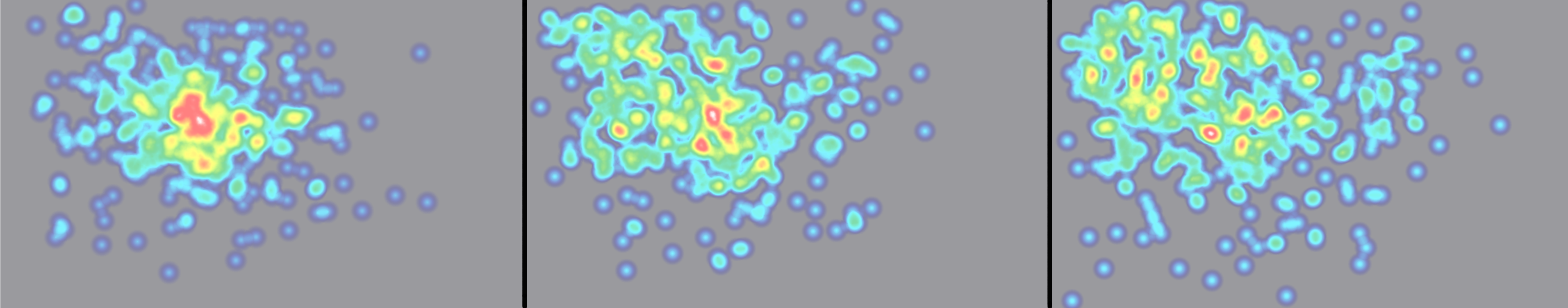
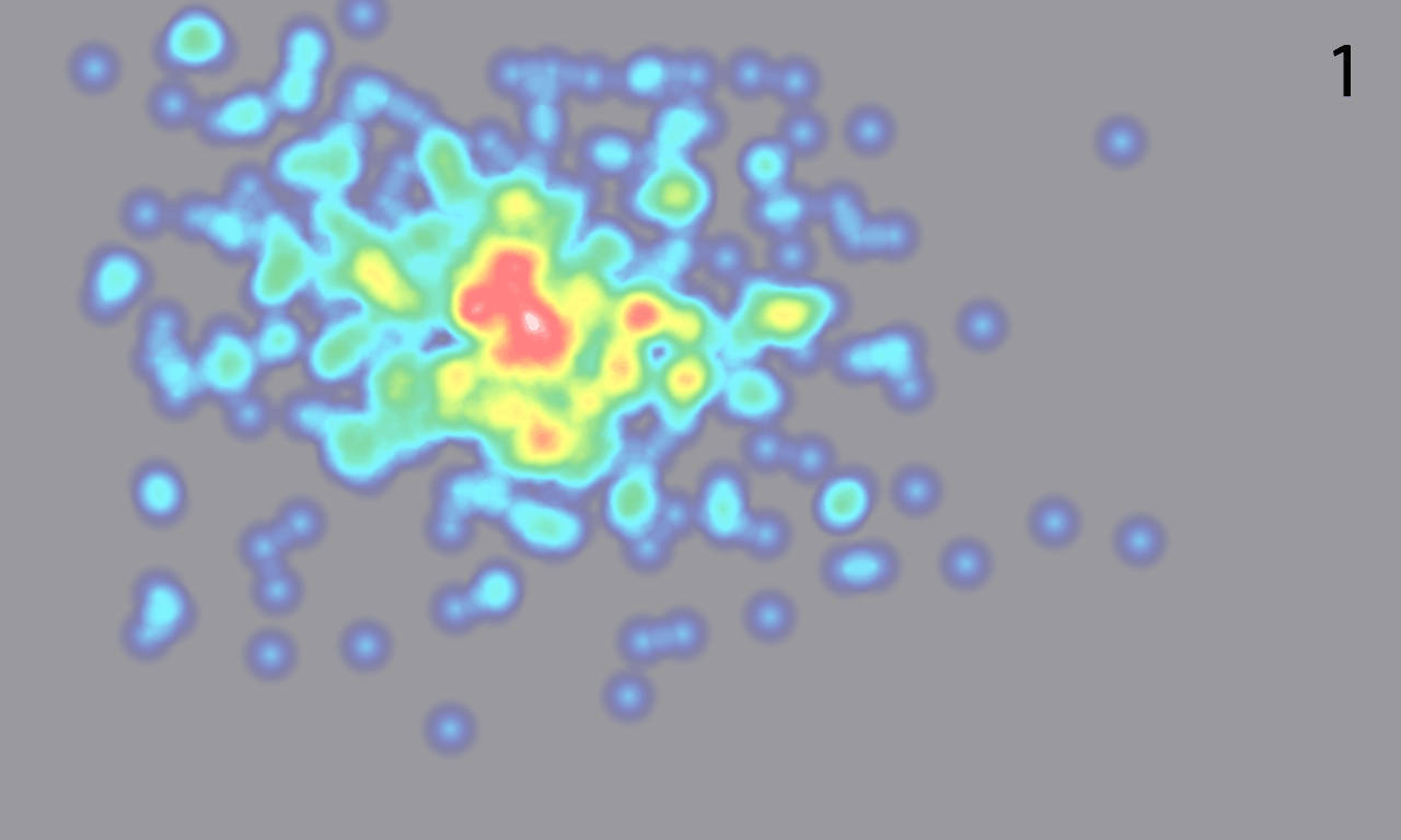
You can see a big GIF rotating between the first 9 fixations here. (Given that fixations are of variable duration, stretching this analysis beyond this is not viable.) Notice that people overwhelmingly start in the middle of the screen. This is a common finding in eye-tracking: when presented with a stimulus, people spend a third of a second staring at the middle of it before reacting [2]. But then look what happens: overwhelmingly, participants’ second fixation is above and to the left of their first, regardless of where their first fixation was. We can demonstrate this quantitatively: below are two histograms showing the angle in radians from the first fixation to second (blue) and fourth fixation to fifth (red).
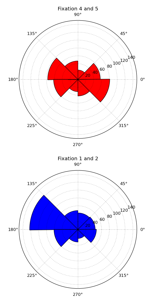 For the blue histogram, the majority of movement is between 135 and 180 degrees — the upper left. The red histogram, which is broadly representative of all the others, is much more dispersed than the blue, indicating that more angles are popular. For the red histogram most popular angles are to the left and right of the current fixation, consistent with what we see when people are reading or skimming text. So to summarize our findings so far, almost every participant glanced up and to the left of their first fixation, and within a second of loading the page, most people were looking towards the upper-left.
To be sure that there isn’t some other explanation for this behavior, we also checked to make sure that these fixations were roughly the same distance from each other. The distribution of distance between fixations turns out to have a long tail, but its mean almost always stays between 200 and 250 pixels. The distribution does not change depending on which fixation we are examining or on the angle to the next fixation [3].
The conclusion we can draw from all this math is that overwhelmingly, people look at the top left of a website before moving on to other features. That’s where they expect navigational information to go; it’s where they expect to orient themselves. It’s also where you can capture their attention; and it’s where you should put your stuff.
Notes
1. The meaning of “representative sample of websites” is not clear. If we simply sample all domains on the Internet, the “representative sites” are probably spam or domain-sitting messages. If you weight by the popularity of a domain, then most websites are search engines or social networks. We think our sample is pretty good for what we’re trying to study.
2. As a 2007 paper from a team at UCSD put it, “In fact, simply using a Gaussian blob centered in the middle of the image as the saliency map produces excellent results.”
3. By Chi-squared test. Note that this is a little bit tricky — to some extent, the statistical blandness of distance between fixations is expected, because the eye rotates a variable-but-small amount between fixations (less than 20 degrees). However, we’re also a little worried that the consistency of distance between consecutive fixations might be due the dispersion-threshold algorithm we use to combine eye-tracking points into fixations.
Neat post!
Just a small quibble – I think you might be using the term ‘fixations’ wrong, and what you’re actually trying to use is the term ‘saccade.’ Fixation sort of refers to something else. Or at least that’s my understanding of this, been a few years since I studied it.
Rich
A saccade is movement between fixations. A fixation is a short (~300 ms) moment when the eye moves relatively little and maintains focus on a single object.
Oh! Righto. You even explained that in your own post here. My fault!
Hey, you guys should do a blogpost about the hardware involved with this stuff. The lab I was in had this equipment around, but I never got to play with any of it myself and I’ve always been curious about the technology involved there, along with the software stack.
No problem Rich! And I’m afraid it would be a short blog post — GazeHawk gets all of our data from our testers using ordinary webcams. No fancy equipment (other than our software) is necessary, which of course allows us to be much less expensive than other eyetracking firms. What sort of lab were you in?
Cognitive and Neural Systems! This is a picture I took of the hardware the vision guys were using. So cool.
No, many web designers are stuck in 1995. Flash is terrible and web designers still don’t understand why. There are even websites with business hours that shut down at local nighttime.
These patterns aren’t an expression of our familiarity with reading top to bottom and left to right. Rather, the pattern described is the result of the website designs. All websites have something eye-catching at the top-left. It’s the standard. Users look there not because of human tendencies, but rather because that’s where the website design guides them.
I bet you if you put a big bold red something in the bottom right corner of your site and not much else of interest on the page, users will look that way, not at the top left!
I’m not sure why you should put your logo in the top left because that’s where users look first.
In most instances, your logo provides no value. Putting it top-left is interruptive – it delays users when they’re trying to do something else.
It can have value sometimes. It confirms to the visitor that she’s in the right place when she’s clicked through from another page.
Nice blogpost but this will vary from site to site.
Pingback: Twitted by daniel_seto
Pingback: What else you should know about the human eye | GazeHawk Blog
Pingback: Principles of Effective Blog Design
Pingback: Principles of Effective Blog Design | WWW.TWITTERSIGN.NET